SWEETGREEN
CLIENT
Sweetgreen
ROLE
Creative Lead
AGENCY
Spec Work
SOCIAL CAMPAIGN
The Sweetgreen rebrand was all about bringing a sense of freshness and energy to the brand. Inspired by their mission to connect real people with real food and foster healthier communities, I leaned into bold colors, organic shapes, and lively visuals. The result is a design system that not only stands out but also invites interaction, encouraging people to pause, look twice, and even engage on social media.


WILD POSTINGS
When designing the street posters, I focused on creating visuals that capture attention instantly. The use of bright colors ensures the posters stand out, while bold typography and engaging imagery maintain balance and visual appeal.
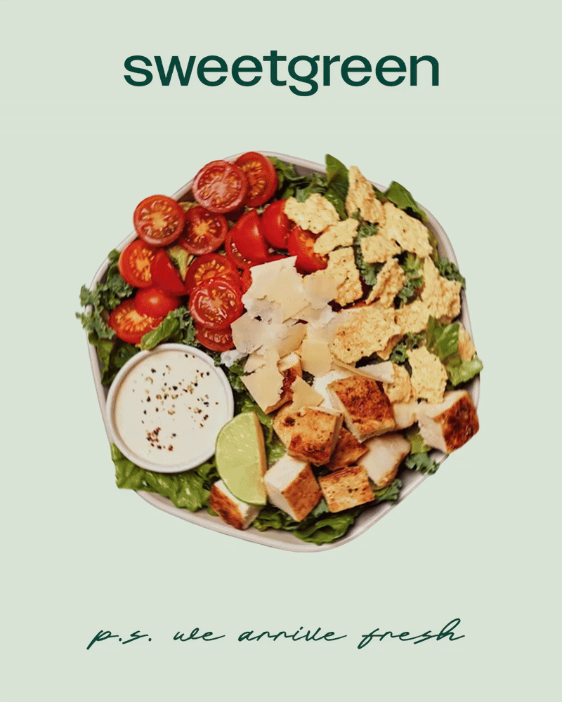
IN-FEED SOCIAL


MOODBOARD
This moodboard establishes the visual direction for my proposed Sweetgreen rebrand. While staying aligned with the brand’s existing guidelines by retaining its core color palette and familiar typography, I introduced bolder content treatments to create a more interactive, fan-forward feel. The use of color blocking and organic shapes adds energy and movement while preserving Sweetgreen’s signature simplicity. The goal was to balance the clean aesthetic long-time fans expect with a more expressive visual style that resonates with Gen Z. The result is a dynamic yet grounded design approach that bridges both audiences.
BEFORE AND AFTER

Drawing inspiration from previous Sweetgreen content, I elevated this piece by making it more dynamic, informative, and user-focused. I added individual ingredient callouts and key nutritional details to give the audience clearer insight into what they’re eating. This added transparency builds trust and strategically strengthens the content’s value, while also encouraging deeper engagement as people spend more time with the piece and feel more connected to the product.

Instead of simply showing menu pairings, I added personality traits and a clear “combo identity,” which gives the content a more human, relatable angle. Strategically, this approach encourages users to stay on the post longer, swipe through the carousel, and see which description fits them best.